Information design: lifesaving devices infographic
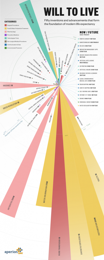
I love the idea of the infographic below, but it fails spectacularly on a couple of information design points. First, and worst, it distorts the values it intends to communicate by hiding parts of the graphic for the larger numbers, thus distorting the visual scale. So, the bifurcated needly (130 million lives saved) is visually larger than vaccines (1 billion lives saved). A few other nits I’ve picked:
- Imprecise language. For example, using “inestimable,” which means “larger than can be estimated,” when what is presumably meant is “cannot be estimated, and might be large or small.”
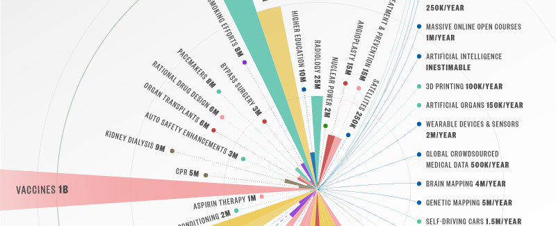
- Also, the “number of lives saved so far” label doesn’t apply to the future advancements, and it isn’t so applied, but the point of the graphic is to make the impact of these advancements visually clear. As such, the now/future advancements can’t be usefully included at all, and probably shouldn’t be.
- The colored dots just inside of the advancement and number has a few problems. First, it’s not used in every case, which naturally makes one ask why. More importantly, the dots appear at different distances from the center, which in this context suggests some relationship to quantity, but there appears to be none.
- Color is a problem throughout. The layout at first suggests that the now/future advancements, all being blue, share some quality or characteristic with the blue elements within the graphic, but no such relationship appears to exist.
- In some cases, the color scheme and progression make adjacent advancements appear to share the same color (cervical cancer screening and sunscreen, for example). Tufte advocated for the use of the smallest effective difference (though I remember it as the more confusing “least effective difference”) in such decisions, but a difference that isn’t discernible cannot be effective.


Leave a Reply