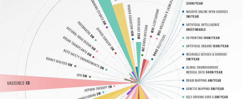
Information design: lifesaving devices infographic
I love the idea of the infographic below, but it fails spectacularly on a couple of information design points. First, and worst, it distorts the values it intends to communicate by hiding parts of the graphic for the larger numbers, thus distorting the visual scale. So, the bifurcated needly (130 million lives saved) is visually […]
